
When is the right time to rebrand? For Maven, that time is now. After nearly 13 years, we’ve changed our look, and launched a brand new website to boot. Here’s why we decided to evolve it.
Let me begin by saying there was nothing wrong with our old look. Our first logo was designed by Jessica’s husband, who is not a designer by trade, and was willing to work for high fives and goodwill at home. We loved it, and we loved our color (dubbed ‘Maven Green’). Over the years it assumed the aura of a child’s lovey – comforting and perhaps slightly worn at the edges, but all the more perfect for its imperfections.
But while our look stayed the same, our services and client focus was evolving. Since we launched the agency in 2006, we’ve focused on providing sophisticated communications strategies with measurable, results-driven outcomes. But we were no longer simply drafting press releases, we were helping clients launch blogs and produce videos to help tell their story. Copy writing turned into content development that gains visibility online. Traditional press outreach became amplified with sophisticated social media strategies to ensure each media placement gets the most visibility. And we’ve developed sophisticated measurement tools we present to clients regularly to showcase ROI. In short, we were growing up, but our look and feel didn’t reflect who we had become.
I’d like to say we realized all of this ourselves, but the reality is a little less profound. Our old website crashed, and we needed to fix it. As we scrambled to get it back up and running, we realized that we didn’t recognize ourselves on the website we presented to the world. We made the tough choice to sunset our beloved logo, and hired an amazing partner, Whitepenny, to help us design a visual identity and new website. Our basic criteria was simple, but also challenging for a creative design firm:
Make us look awesome and fresh, but don’t change our name, stray too far from our mark, or leave the green color palate. (In retrospect, we were probably an annoying client, but they never let on if they thought so).
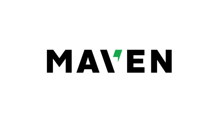
Whitepenny immediately understood what we wanted to achieve – a look and feel that captured our integrated, digital-forward approach that is measurement focused and results-oriented. The logo became stronger and crisper, with clean lines and a bolder color palate of black, white, cool gray and green. We dropped the word ‘Communications’ from the mark. The new visual identity reproduces easily, and translates cleanly to different vehicles and platforms both on and offline. The website became 100 percent user-focused, making it easy to showcase our client success stories and the industries we serve. Plus, we made our mantra of ‘outcome over output’ a little more front and center, since measurement is so much of who we are. And ‘Maven Green’ is now PMS 7481.
These past six months have been quite a journey. We’ve poked and prodded at ourselves, evaluated every word choice, and talked to myriad clients, partners and friends. The resulting brand is one we are incredibly proud of, and positions us for the next stage of growth at Maven. We hope you like it as much as we do.
![]()
Posted In Maven Communications